Overview
The Applegreen Electric App allows is available to download from iOS and Android devices. It enables users to start, stop and pay for charging their electric vehicle at selected charging stations within the Applegreen Electric charging network. Charging stations within the Applegreen Electric network can be located using the app.
Goal
The goal of this particular project was to re-design the sign-up process of the app to include the following;
- Map user journey from start to finish
- Create a visually appealing design
- Reflect brand identity
- Resonate with our target audience
- Improve navigation, readability, accessibility
- Create clear, compelling CTAs to encourage user engagement and conversion
My Role
- UX designer & researcher
- Visual design
- Prototyping
- Presentation
Process
Design Thinking is a dynamic, iterative approach that empowers us to challenge assumptions, ask questions, and foster innovative thinking. The goal is to make products, services, and processes better by actively involving users in the entire process. This is a process I used throughout. However, I only had a week to create my designs and ideas so didn't get to test.

Empathise
The first stage of the design process is to develop a deep understanding of the target audience/customer/consumer and their unique perspective to identify and address the problem at hand. To do this, I carried out a number of steps.
1. About Applegreen
Before redesigning their app, I researched the company to grasp its brand, goals, and values. This ensured that my redesign aligned with their identity and strategic objectives, supporting their mission and market positioning.
Findings
- Convenience - seamless UX with customer first.
- Environmental impact - powering stations with renewable energy.
- Credibility - 10+ years experience in the EV industry with 10+ models of charging hardware.

2. Experiencing the Applegreen sign-up process
I put myself into the shoes of the consumers by downloading the app and signing up. By immersing myself into the sign up process, I could experience first hand what the consumers experience.

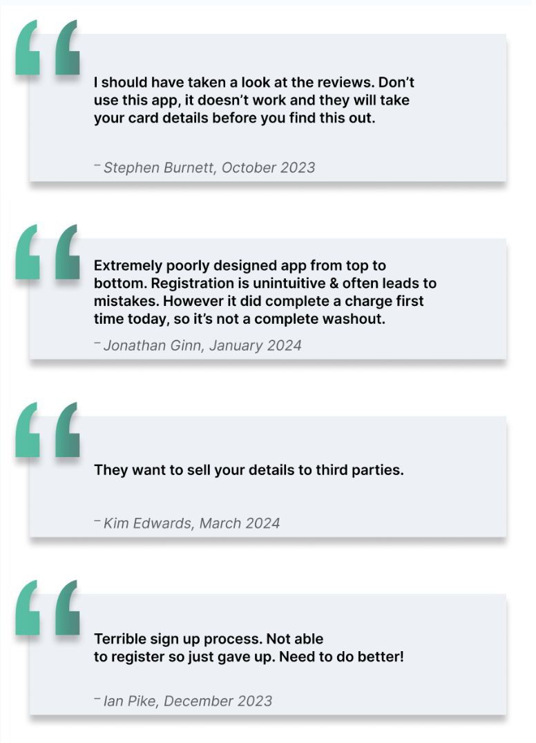
3. Online Reviews
I visited app stores for ios and android and looked through all of the consumer reviews. represents an opportunity to understand user pain points, desires, and perceptions. Reviews also provide insight into competitors and general issues users are facing.


4. User Survey
I conducted a user survey to give me in insight into the needs and expectations of the users by gathering information about pain points, features that they do or don't like, and areas in which you can improve. This helped me identify key pain points and opportunities for improvement as well as data identifying the target audience.
Some of the questions asked during survey
- Age group?
- Gender?
- Likes/dislikes?
- Would you use the app again?

5. Target market, EV history & prospects
Findings
- As of Feb ‘24, 69,700+ EV cars, 35,102 hybrid cars on Irish roads.
- Number of new EV cars rose by 45% last year.
- 45-64 years average age.
- In 2023, Wicklow only county where EV sales outstripped all other fuel types.
- Growth expected in 2024 but government incentives needed (Brian Cooke, SIMI).

6. Competitor Analysis
As a starting point, I did some market research on competitors to investigate the current offerings in the market and take inspiration from particular features that I liked about each app. ‘Electroverse’ was my favourite because of it’s simplicity but on the downside, there were too many steps. Still, I took inspiration from this app and others like ‘Ohme’ and ‘Plugshare’.


Competitors Mission Statements
Few companies can clearly articulate WHY they do what they do. When Simon asks WHY, he’s not referring to making money—that’s a result. Your WHY is your purpose, cause, or belief. WHY does your company exist? WHY do you get out of bed every morning? And WHY should anyone care about the work you do?When most organisations or people think, act, or communicate, they do so from the outside in (from WHAT to WHY). We say WHAT we do, we sometimes say HOW we do it, but we rarely say WHY we do it. But the WHY is the most crucial part of any endeavour or communication.


Define
1. User Survey Findings
16 Respondants

2. User Interview Insights

3. User Problems

4. Possible Solutions

5. Personas
Based on the data collected from my interviews and surveys, I created four personas. Two android users, two ios users.

6. User Journey Map
I created a user journey map for each of my four personas. When complete, the user journey map identifies all current key customer touch points and describes in detail the customer’s goals, motivations, and feelings at each step. This helped me to identify different ways to enable the user to achieve their goal as quickly and easily as possible.

7. Designing for Accessibility
Examining AG Electric Colour Palette
Using Coolors.co, I tested the colours used in the Applegreen Electric app for contrast and it scored poorly in all but one test.

Creating the colour palette
AAA: is the pinnacle of accessibility. It includes all the criteria of A and AA, with additional requirements that make content accessible to the fullest extent possible, even in challenging visual conditions. I used Coolors.co again whebn creating my palette and achieved AAA status for all.

Rounded buttons
I made the buttons more rounded because they are easier for users with motor impairments to recognise and press.

Prototype
Wireframes
Early sketches and ideas

Mockups
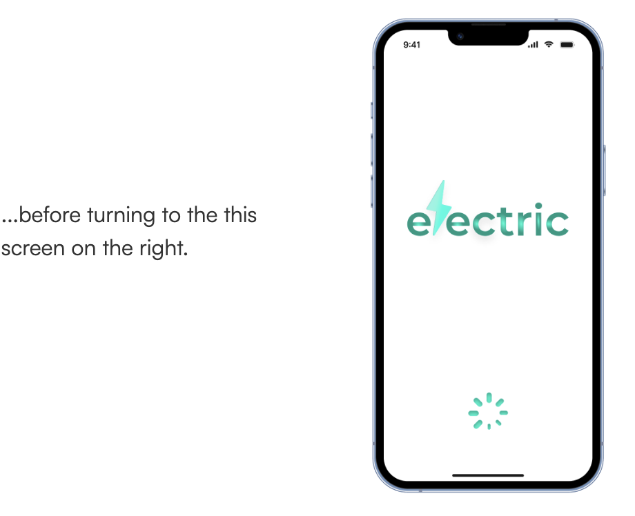
Splashscreen
My idea was that a flash of lightning would quickly progress through “electric’, then the tiny “apple green” logo would appear above it, and the lightning would progress through it....


